
Overview of .NET 3.0 Through Demos
 I recently had to give an overview presentation of Microsoft’s new .NET 3.0 technologies at work.
Since I don’t like writing or giving long PowerPoint presentations I decided to cut down as much as possible on slides and talk my way through a bunch of demo applications demonstrating the various aspects of .NET 3.0.
So, here’s a bunch of good demos to demonstrate .NET 3.0 capabilities:
Integration Between Developer and Designer
With .NET 3.0, Microsoft will provide Visual Studio, aimed for developers, and the Expression Suite, aimed to designers.
Both packages are designed to work together so that developer and designer could work together, on the same project and files. Finally the barrier between the designer, who works with Photoshop and produces graphic files, and developer who works in Visual Studio and produces code is broken.
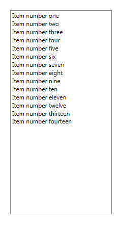
To demonstrate this I used the XamlPad to show how both developer and designer would work on the design and code of the same window which our case contains a single ListBox.
The developer, simply defines a page containing a ListBox control and some values so that he can start working on some codebehind logic:
<Page xmlns="http://schemas.microsoft.com/winfx/2006/xaml/presentation" xmlns:sys="clr-namespace:System;assembly=mscorlib" xmlns:x="http://schemas.microsoft.com/winfx/2006/xaml" xmlns:mc="http://schemas.openxmlformats.org/markup-compatibility/2006" xmlns:d="http://schemas.microsoft.com/expression/interactivedesigner/2006">
	<Grid x:Name="DocumentRoot">
		<ListBox Name="list" Width="200" Height="400">
			<ListBoxItem>Item number one</ListBoxItem>
			<ListBoxItem>Item number two</ListBoxItem>
			<ListBoxItem>Item number three</ListBoxItem>
			<ListBoxItem>Item number four</ListBoxItem>
			<ListBoxItem>Item number five</ListBoxItem>
			<ListBoxItem>Item number six</ListBoxItem>
			<ListBoxItem>Item number seven</ListBoxItem>
			<ListBoxItem>Item number eight</ListBoxItem>
			<ListBoxItem>Item number nine</ListBoxItem>
			<ListBoxItem>Item number ten</ListBoxItem>
			<ListBoxItem>Item number eleven</ListBoxItem>
			<ListBoxItem>Item number twelve</ListBoxItem>
			<ListBoxItem>Item number thirteen</ListBoxItem>
			<ListBoxItem>Item number fourteen</ListBoxItem>
		</ListBox>
	</Grid>
</Page>
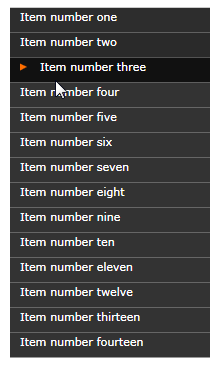
At this point, the designer can take control and actually make the ListBox look cool using styling and templates:
<Page xmlns="http://schemas.microsoft.com/winfx/2006/xaml/presentation" xmlns:sys="clr-namespace:System;assembly=mscorlib" xmlns:x="http://schemas.microsoft.com/winfx/2006/xaml" xmlns:mc="http://schemas.openxmlformats.org/markup-compatibility/2006" xmlns:d="http://schemas.microsoft.com/expression/interactivedesigner/2006">
	<Grid mc:Ignorable="d" x:Name="DocumentRoot">
		<Grid.Resources>
			<Style x:Key="{x:Type ListBox}" TargetType="{x:Type ListBox}">
				<Setter Property="Cursor" Value="Hand" /> <Setter Property="Template"> <Setter.Value> <ControlTemplate> <Border> <ScrollViewer> <ItemsPresenter /> </ScrollViewer> </Border> </ControlTemplate> </Setter.Value> </Setter>
			</Style>
			<Style x:Key="{x:Type ListBoxItem}" TargetType="{x:Type ListBoxItem}">
				<Setter Property="Foreground" Value="#FFFFFF" /> <Setter Property="FontFamily" Value="Verdana" /> <Setter Property="FontSize" Value="11" /> <Setter Property="Template"> <Setter.Value> <ControlTemplate TargetType="{x:Type ListBoxItem}"> <Canvas Width="Auto" Height="25"> <Rectangle Name="filler" Canvas.Top="0" Canvas.Left="0" Width="200" Height="25"> <Rectangle.Fill> <SolidColorBrush x:Name="fillb" Color="#333333" /> </Rectangle.Fill> </Rectangle> <Path d:LastTangent="0,0" Stroke="{x:Null}" Fill="#FF6E00" HorizontalAlignment="Right" VerticalAlignment="Top" Width="7" Height="7" Canvas.Left="15" Opacity="0" Canvas.Top="6" x:Name="Path" RenderTransformOrigin="0.5,0.5" Stretch="Fill" Data="M601.11544,190.39485 L590.06202,213.0964 613,213"> <Path.RenderTransform> <TransformGroup> <RotateTransform Angle="90"/> </TransformGroup> </Path.RenderTransform> </Path> <ContentPresenter Name="con" Canvas.Top="2" Canvas.Left="10" /> </Canvas> <ControlTemplate.Triggers> <EventTrigger RoutedEvent="Button.MouseEnter"> <BeginStoryboard> <Storyboard> <ColorAnimation Storyboard.TargetName="fillb" Storyboard.TargetProperty="(SolidColorBrush.Color)" From="#333333" To="#111111" Duration="0:0:0.1" /> <DoubleAnimation Storyboard.TargetName="con" Storyboard.TargetProperty="(Canvas.Left)" From="10" To="30" Duration="0:0:0.1" /> <DoubleAnimation Storyboard.TargetName="Path" Storyboard.TargetProperty="(Path.Opacity)" From="0" To="1" Duration="0:0:0.1" /> <DoubleAnimation Storyboard.TargetName="Path" Storyboard.TargetProperty="(Canvas.Left)" From="15" To="10" Duration="0:0:0.2" /> </Storyboard> </BeginStoryboard> </EventTrigger> <EventTrigger RoutedEvent="Button.MouseLeave"> <BeginStoryboard> <Storyboard> <ColorAnimation Storyboard.TargetName="fillb" Storyboard.TargetProperty="(SolidColorBrush.Color)" From="#111111" To="#333333" Duration="0:0:0.8" /> <DoubleAnimation Storyboard.TargetName="con" Storyboard.TargetProperty="(Canvas.Left)" From="30" To="10" Duration="0:0:0.3" /> <DoubleAnimation Storyboard.TargetName="Path" Storyboard.TargetProperty="(Path.Opacity)" From="1" To="0" Duration="0:0:0.1" /> <DoubleAnimation Storyboard.TargetName="Path" Storyboard.TargetProperty="(Canvas.Left)" From="10" To="15" Duration="0:0:0.1" /> </Storyboard> </BeginStoryboard> </EventTrigger> </ControlTemplate.Triggers> </ControlTemplate> </Setter.Value> </Setter>
			</Style>
		</Grid.Resources>
		<ListBox Name="list" Width="200" Height="400">
			<ListBoxItem>Item number one</ListBoxItem>
			<ListBoxItem>Item number two</ListBoxItem>
			<ListBoxItem>Item number three</ListBoxItem>
			<ListBoxItem>Item number four</ListBoxItem>
			<ListBoxItem>Item number five</ListBoxItem>
			<ListBoxItem>Item number six</ListBoxItem>
			<ListBoxItem>Item number seven</ListBoxItem>
			<ListBoxItem>Item number eight</ListBoxItem>
			<ListBoxItem>Item number nine</ListBoxItem>
			<ListBoxItem>Item number ten</ListBoxItem>
			<ListBoxItem>Item number eleven</ListBoxItem>
			<ListBoxItem>Item number twelve</ListBoxItem>
			<ListBoxItem>Item number thirteen</ListBoxItem>
			<ListBoxItem>Item number fourteen</ListBoxItem>
		</ListBox>
	</Grid>
</Page>
Note that I took this slicky ListBox style sample from theWPFblog.
NY Times Reader
 Dubbed as the “Killer Application” for WPF, this application demonstrates WP F’s power in layouts and documents.
Using WPF, this application imitates the exact layout (which is NY Times’s trademark) of the NY Times paper without being static like the web site. Content can adjust itself to resizing and allows you to easily browse through all the paper’s sections.
There’s even a section where you can slideshow through all the photos that appear on the paper.
The NY Times Reader is currently available as beta and you can register (free) and download it yourself to check it out.
WPF Sudoku
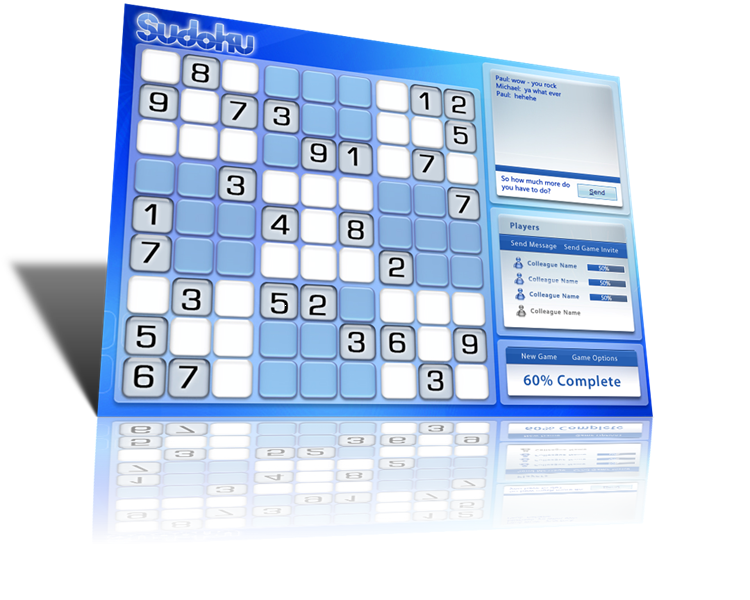 This application looks great and shows how you can use the Windows Communication Foundation, the Windows Workflow Foundation and the Windows Presentation Foundation to build a P2P version of Sudoku. The game generation logic defined using WF, the user experience is implemented using WPF which also allows it to be deployed both as a windows application or as an XBAP and the P2P servers which allows player to race each other is built using WCF.
The Sudoku sample is available here.
 Woodgrove Financial Application
This applications demonstrate the power of XBAP in bringing rich user experience applications to the web.
It’s a financial application that displays complex 3D graphs and running directly from the browser.
This demo is available here.
Microsoft Max
Microsoft codename “Max” is another application from Microsoft showing slick WPF UI and animations.